Getting Inspired At The Opta Pro Forum
At the thoroughly enjoyable Opta Pro Analytics Forum (a review of which is available on their site here), perhaps the most interesting presentation was given by Pedro Marques (Twitter), who is a First Team Match Analyst at Manchester City.
He gave amateurs like myself an insight into the type of analysis that the professional clubs carry out on opponents ahead of a forthcoming match. Perhaps the most surprising thing was that it didn't look particularly advanced, or better than the work that many of the top fanalysts are currently producing (albeit with representatives from every other Premier League club there, I'd be amazed if he gave away all of their secrets). I wondered if I were capable of producing something similar?
Pedro showed us an example of the pre-match pack that City's analysts pull together. As it was for a match that his team won 5-1, away at Spurs, it was probably worth paying attention to! One thing that caught my eye was a passing network his team had produced using Node XL, which is not something I had used previously myself.
The principle is the same as I use for my pass combination heat maps, which show how many times each player pass to each other, and they also reminded me of the passing networks that @WillTGM occasionally produces on his blog (an example of which can be found here).
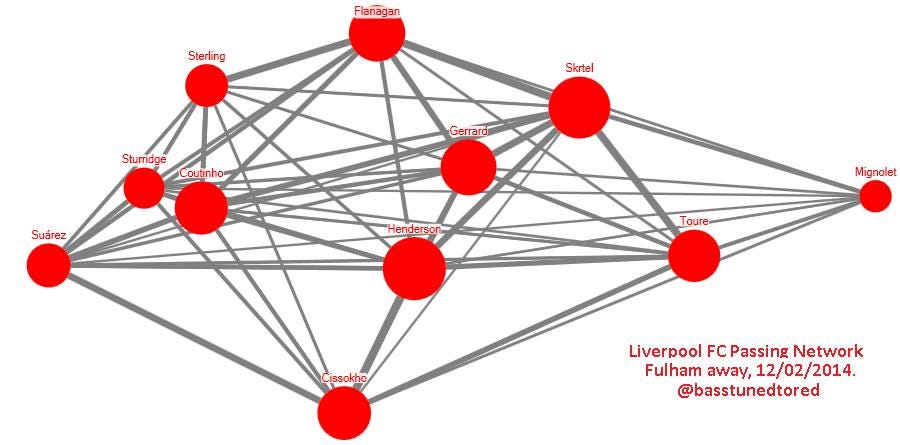
Having downloaded Node XL, I thought I'd have a go at producing a passing network myself. For comparison to my prior work, here is the pass combination heatmap for Liverpool's last match, the 3-2 win at Fulham.
Here is my first attempt at a passing network, for the same match. The size of the circles relates to the total number of passes that each player made, the width of the lines joining them likewise, and the location of the player is based on their average postion for the match as a whole, as taken from WhoScored.

Regular visitors to my site will know that graphics are not really my strong point; I'm actually more of a numbers guy. Who knew? The passing networks on the aforementioned blog belonging to @WillTGM are better, for instance. I think there isn't enough differential in the line width either, so perhaps this could be improved (perhaps by using different colours to give it a 'heat map' edge?)
But I like that it shows the same information as the above heat map, whilst also incorporating average position information too. I'm not sure I can improve it further due to my lack of graphical ability, and it also took a lot longer than the pass combo heat map took to assemble, but if you have any feedback as to how it can be improved then please leave a comment below.
Hopefully Arsene Wenger doesn't see this before the cup match on Sunday though...
Recent related posts you might like:
When Is A Chance Not Really A Chance (Or Even A Shot?) – One for the football analysts amongst you. I spotted a discrepancy in some match stats, and investigated further…
PLCQ: Twenty Game Round Up – Which teams have been creative in the best areas, and/or restricted their opponents too? Includes a look at which teams have got more or fewer assists than my model suggests they should have.
Liverpool’s Chance Champion – A look at which Reds have created the most chances in 2013/14, and who has found the best areas most frequently.
LFC Pass Combination Heatmaps 2013/14 – A look at which players have been most involved pass-wise, and who they’ve linked up with in every league match this season.
Please check out my other articles, and follow me on Twitter or via Facebook. Thanks.
